
Canada 150 Art Project – Newfoundland Labrador
- At July 12, 2017
- By katzp
- In Canada 150 Artworks, Recent Work, Special Events, Travel
 0
0
Welcome to the third in a series of ten watercolor paintings to honor Canada’s Sesquicentennial – this one featuring Newfoundland Labrador. Read on for more about the backstory behind this painting, and to learn how you can make this painting yours.
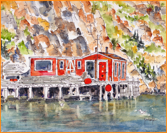
The Backstory: You’ll find this fishing stage along the edge of Quidi Vidi Harbour in St John’s, Newfoundland. It’s where I recently spent a delightful afternoon sketching while soaking up the September sun. On that same visit to this capital of Newfoundland Labrador, I also explored The Rooms, a recently opened museum and art gallery high on the hill overlooking the Narrows.
My earliest and most memorable experience on ‘The Rock’ was a 1981 Lobster Fest in Pippy Park just west of St John’s proper. Our ‘Come From Away’ group members were seated on stools around upended barrels covered in newspaper and populated with hammers, picks, and tubs of melted butter. Throughout the evening, fresh cooked lobsters were deposited repeatedly on our makeshift tables while our Newfie hosts moved through our crowd of newbies giving lessons on how to attack and devour. It was a riot of fun and a tasty introduction to Atlantic food and Newfoundland hospitality.
I’ve also enjoyed the music in the pubs on George Street and been screeched in – twice! Apparently the first time didn’t take – or at least the ceremonial officials didn’t believe I had actually kissed the cod!
Over the years, I’ve returned several times to the Avalon Peninsula and enjoyed exploring these sights:
- St John’s Signal Hill, the Battery, the Narrows, and the colorful rows of Jelly Bean Houses
- Cape Spear (Newfoundland’s most easterly and oldest surviving lighthouse)
- Scenic Petty Harbour
- Brigus South (towards Cape Broyle), an ancient fishing village settled in the 1600’s with a most colorful array of dories lining the banks of the inlet
Our son-in-law, Marc, was born and raised in Pasadena, a small town near Cornerbrook along the beautiful Humber Valley in the western part of Newfoundland. I have yet to visit his home territory, but hope to do so sometime soon.
How You Can Make This Painting Yours: In honor of our country’s 2017 anniversary celebrations, I’ve created one watercolor painting to honor each province.
One unique provincial landscape, seascape or streetscape will be featured each week throughout the summer. Ten paintings are up for grabs – one for each province – and one each week.
Each original painting is 8” x 10” in size and each one will arrive mounted in a double white mat bringing the outer dimensions to 11” x 14” – ready to pop into a standard frame of your own choosing.
The price for each painting will be $150 (taxes included) plus $15 for shipping to anywhere in Canada.
If you are looking for a unique remembrance of Canada 150, and you’ve always wanted to buy an original watercolor from the Pauseworks Studio, here’s your chance.
Just send me an email message with the words ‘Canada 150 – I’ll Take It’ in the subject line. The first reader to call dibs on each week’s masterpiece takes it. Good luck to all!
If you wish to Subscribe or Unsubscribe to notifications from the Pauseworks Studio Blog,
you can do so in the Let’s Keep In Touch area on any page of the Pauseworks Studio website.
Canada 150 Art Project – British Columbia
- At July 05, 2017
- By katzp
- In Canada 150 Artworks, Recent Work, Travel
- 0
Welcome to the second in a series of ten watercolor paintings to honor Canada’s Sesquicentennial – this one featuring British Columbia. Read on to learn more about the backstory behind this painting, and to find out how you can make this painting yours.

The Backstory: Beautiful British Columbia! That’s what it says on their license plates, and they are definitely telling the truth. There is endless beauty across this westernmost Canadian province.
This particular scene looks across False Creek from Granville Island towards downtown Vancouver. This area looks a lot different today than it did in 1986 when we visited it during the World’s Fair – Expo 1986.
I have visited Vancouver and other parts of British Columbia many times over the years for pleasure and for work. Dave and I honeymooned our way through the province in 1974. A couple years later, I chaperoned a dozen teen-agers to a Western Canadian 4-H Conference in Vancouver. A colleague and I drove a jam-packed 15 passenger van – with no air conditioning – in the high heat of August, tenting all the way there and back. Memorable, for sure!
Here are a few other memories of BC that also stand out in my mind:
- watching the waves roll in along Pacific Rim’s Long Beach near Tofino
- exploring the Inner Harbor of Victoria
- dining at Sooke Harbor House
- visiting the wineries along the Naramata Bench
- catching the salmon run on the Adams River
- boating with friends on Okanagan Lake
- skiing through the snow ghosts at Big White
- hiking through the Othello Tunnels along the Coquihalla River
- riding the ferry across Kootenay Lake
- cooling our overheated hoofies in the refreshing waters of the Similkameen River, and
- singing around a community firepit at a campground in Blue River (north of Kamloops)
I know I haven’t yet made all my BC memories and look forward to returning again and again in the years ahead.
How You Can Make This Painting Yours: In honor of our country’s 2017 anniversary celebrations, I’ve created one watercolor painting to honor each province.
One unique provincial landscape, seascape or streetscape will be featured each week throughout the summer. Ten paintings are up for grabs – one for each province – and one each week. This week – this beauty from BC.
Each original painting is 8” x 10” in size and each one will arrive mounted in a double white mat bringing the outer dimensions to 11” x 14” – ready to pop into a standard frame of your own choosing.
The price for each painting will be $150 (taxes included) plus $15 for shipping to anywhere in Canada.
If you are looking for a unique remembrance of Canada 150, and you’ve always wanted to buy an original watercolor from the Pauseworks Studio, here’s your chance.
Just send me an email message with the words ‘Canada 150 – I’ll Take It’ in the subject line. The first reader to call dibs on each week’s masterpiece takes it. Good luck to all!
If you wish to Subscribe or Unsubscribe to notifications from the Pauseworks Studio Blog,
you can do so in the Let’s Keep In Touch area on any page of the Pauseworks Studio website.
Canada 150 Art Project – Prince Edward Island
- At June 28, 2017
- By katzp
- In Canada 150 Artworks, News, Recent Work
- 0
Welcome to the first in a series of ten watercolor paintings to honor Canada’s Sesquicentennial – this one featuring Prince Edward Island. Read on to learn more about the backstory behind this painting, and to find out how you can make this painting yours.

The Backstory: It’s no accident that Prince Edward Island leads the line up of my Canada 150 Sesquicentennial paintings. My prairie roots reach all the way across the country to New Perth, near Montague, on the eastern end of the island.
My maternal grandfather, John St Clair Hamilton, was born in New Perth in 1884. He came west and homesteaded at Viscount, Saskatchewan in 1910. It was here that he met and married my grandmother, and raised five daughters including my mom, Ruth.
I first set foot on PEI in the early 1970’s, when I travelled to attend a University Student Conference in Charlottetown. During that visit my mom’s cousin, Ola, toured me around the island – including visits to the original family stomping grounds and the seaside. I remember being fascinated by the lighthouses with their varied shapes and sizes (like this one at Covehead Harbour).
A decade later my husband and I spent a few days on PEI in the month of June. The lupins bloomed in the ditches from one end of the island to the other. We enjoyed seeing them almost as much as we enjoyed sampling the lobsters.
A Prince Edward Island spruce tree towers over the front of our home here in Saskatoon. My mom pulled that little spruce sapling from the ditch in PEI on her visit to the island in the mid ’80s. We planted it here in Saskatoon, never expecting it to survive the winter. It’s now well over 30 feet in height –a testament to PEIslander hardiness.
How You Can Make This Painting Yours: In honor of our country’s 2017 anniversary celebrations, I’ve created one watercolor painting to honor each province.
One unique provincial landscape, seascape or streetscape will be featured each week throughout the summer. Ten paintings are up for grabs – one for each province – and one each week.
Each original painting is 8” x 10” in size and each one will arrive mounted in a double white mat bringing the outer dimensions to 11” x 14” – ready to pop into a standard frame of your own choosing.
The price for each painting will be $150 (taxes included) plus $15 for shipping to anywhere in Canada.
If you are looking for a unique remembrance of Canada 150, and you’ve always wanted to buy an original watercolor from the Pauseworks Studio, here’s your chance.
Just send me an email message with the words ‘Canada 150 – I’ll Take It’ in the subject line. The first reader to call dibs on each week’s masterpiece takes it. Good luck to all!
If you wish to Unsubscribe to notifications from the Pauseworks Studio Blog,
you can do so in the Let’s Keep In Touch area on any page of the Pauseworks Studio website.
Sweet And Soothing Sausalito
- At April 01, 2017
- By katzp
- In Behind The Scenes, Recent Work, Travel
- 2
 Sausalito, California, was our kick back and put our feet up destination after a recent cruise out of San Francisco to the Mexican Riviera. We enjoyed the hospitality of the charming Gables Inn on Princess Street. And I loved starting each day with a coffee (and a sketch) on our sunny veranda with its views of the bay.
 Sausalito (with a population of just over 7000) is located at the north end of the Golden Gate bridge, a short ferry ride across the bay from its big city sister, San Francisco. Over the years, Sausalito morphed from a World War II shipbuilding center into a vibrant arts community with a quirky collection of houseboats, and a plentiful array of shops and galleries.
American gangster, Baby Face Nelson called Sausalito home in the 1920s. Otis Redding wrote Sitting On The Dock Of The Bay while staying on a houseboat in 1967. And authors, Isabelle Allende and Amy Tan, call Sausalito home today.
If you’re looking for a sweet and relaxing little get away spot – close enough to San Fran for big city adventures – but far enough away to get some rest and renewal – this could just be your spot.
Over the course of our three day stay, I created a number of sketches. Click on each sketch featured below to see an enlarged version and to read a bit more about how and where they came to be.
All originals are available for purchase. Just inquire directly about size and price. And, of course, each image is also available as a reproduction on paper, canvas, acrylic or metal through the Fine Art America service. You’ll find the size, medium and pricing details when you click through to the images.


With Or Without? Survey Says…
- At February 07, 2017
- By katzp
- In Behind The Scenes, Process, Recent Work
- 0
 One of the things I love about watercolor is the brilliance of the pure white paper. To preserve that freshness, I’m often inclined to leave a lot of the white paper showing. – especially in some of the vignettes that I create.
On a recent excursion with the Saskatoon Plein Air painting group, I sketched a sweet little daffodil blooming in the Mendel Conservatory. I initially left the background white, with the flower framed by a black line squiggle.

After scanning that image in its ‘natural state’, I decided to experiment by adding a contrasting blue background inside the frame.
I then posted the two images to Facebook along with the questions: “With or without? And why?”
53 Facebook followers weighed in with their opinions. A huge majority (a whopping 94% of the voters) preferred the image ‘with’ the blue background.
They gave these reasons: contrast highlights the flower, makes color more vibrant, makes it look warmer, gives it depth and dimension, makes it more positive, feels more finished and complete, makes the flowers pop, and gives context.
The two votes for ‘without’ chose the image with the white background because of its simplicity and understatement.
 One of the ‘without’ supporters mocked up a couple of images with colored mats to show how the frame choice could make the image pop in different ways. This reinforces the point made by another respondent who was squarely on the fence, saying the preference for a white or color background ‘depends on the frame’.
One artist that I studied with (can’t remember who) noted that if you are wondering whether you should or whether you shouldn’t (change a line, add a color, tweak the background), the answer is always, ‘Yes, you should.”
His point was that the change just might be successful; and if it isn’t successful, at least you’ve learned something about what NOT to do next time. Grand experiments in the pursuit of learning!
PS – Are you wondering which version I prefer? That’s just like asking a parent to choose a favorite child. I demur. I love them both.
Can You Tap The Tropics On The Prairies?
- At January 30, 2017
- By katzp
- In Behind The Scenes, Recent Work
- 6

Our Saskatoon Plein Air painting group met on Saturday morning at the Mendel Gallery for a couple of hours of sketching, painting and artful camaraderie.
When it’s too cold to paint outdoors, there’s always the Outdoor Indoor option.
Most of us chose to park ourselves in the Conservatory where the air was warm and humid and the foliage was green (unlike the trees and shrubs outdoors).
The potted daffodils and tulips were just bursting into bloom, offering hope that spring will soon be on its way.
I plopped myself down on a stool in a corner of the conservatory nearest the cacti – being careful not to back into any surprises.
Pots of bulbs nestled in amongst the permanent display of succulents delivered pops of color.
First to catch my eye, my pen and my brush was a cluster of yellow daffodils.

While I waited for the daffodils to dry, a sweet little barrel cactus called my name.
He and his buddies served as the focal point for sketch number two.
And finally, for something just a little bit different, I decided to create a botanical sampler with each of the six squares on the page devoted to a different type of foliage or blossom.
 It was a sweet way to spend a winter morning – basking in the sun streaming through the greenhouse glass, breathing in the tropical atmosphere, and hanging out in the company of plants and fellow artists.
PS 1 – If you’re interested in joining the adventures of the Saskatoon Plein Air group, reach out to the fine folks at Hues Art Supply. They serve as headquarters for the group and support us by sending out information on upcoming gatherings. Events are generously coordinated by Jean Dudley. No special supplies are needed to join in. In fact, all you really need is a sketchbook and a pencil.
- PS 2 – A click on each of the Daffodils and Barrel Cactus sketches will take you to a larger version of these images on my fine art website. Originals and reproductions are always available for purchase.
Up The Coulee
- At January 24, 2017
- By katzp
- In Behind The Scenes, Process, Recent Work, Special Events
- 0
 Sometimes inspiration springs from more than one source.
Such was the case with this painting titled, Up The Coulee.
I worked on this during a recent Watercolor Workshop taught by landscape artist, Alison Montgomery.
Alison’s work inspired me to try some big sky clouds.
 I stumbled across the inspiration for the sky (with the bonus of a really colorful rock outcropping) in a photo shared by Jamie Angus in the Saskatchewan Scenery group on Facebook.
 I was also drawn to the beauty of the rolling hills and fall foliage of the Slade Ranch in southwestern Saskatchewan.
The ranch is featured in this image posted by my friends, Brenda Baker and Art Slade.
 I played around with combinations that would partner the two inspirations in a combined sketch. See the black and white rough shown on the right.
It seemed to work. And so I dove right in with paintbrush and color!
You still have a few days to see Up The Coulee in real life along with a couple of my ink and watercolor abstracts created in a class with Anne McElroy.
All three pieces – along with the work of other workshop participants – are on display in The Workshop Show at Hues Art Supply (1818 Lorne Avenue in Saskatoon) until the end of January.
A Few Simple Pleasures Still Available
- At March 21, 2016
- By katzp
- In Recent Work, Special Events
- 0
Half of the images in the Simple Pleasures series headed off to new homes during the March 20 Spring Thing Show & Sale. The remaining 13 are still available for purchase, and shown below.
If you missed the show and there is one here that catches your eye – as a treat for yourself or someone else – just drop me a line and claim it for yourself.
The original images are 5×5″ – framed up to 6×6″ – in black,white or espresso stand up frames. Price per image is $70 plus $15 shipping/handling plus taxes for a total of 93.50.


Simple Pleasures Previews
- At March 10, 2016
- By katzp
- In Recent Work, Special Events, Video
- 0
Here’s a preview of a few sketches from the Simple Pleasures – Small Treasures Series. These and more of their friends will be offered as part of the live and virtual ‘Spring Thing’ Show & Sale.
The event is scheduled for the afternoon of March 20th – the first day of spring. Stay tuned for further updates and samples.
