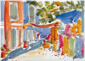
Painting The Streets Of Philipsburg, St Maarten
- At January 26, 2021
- By katzp
- In Process, Recent Work
 2
2
 On these cold wintry January days in Saskatchewan, I like to recall our travels to warmer climes.
When I work with a source photo from some place hot and sunny, it transports me back in time and space.
Such was the case last week, when I pulled out this photo taken a year ago on the streets of Phillipsburg, the capital of the Dutch side of Sint Maarten in the Caribbean.
My first step was to create a values sketch with sepia pen in my sketchbook.
It’s a great way to work out the darks and lights in a composition and make decisions about what to include and what to omit from the painting.
From there, I created an ink sketch on watercolor paper and started adding color. I used rough textured Winsor and Newton watercolor paper.
It created some lovely textured effects in the color (i.e. – the blue awning on the right), but it also seemed to dampen the vibrancy of the color.
 Having taken that piece as far as I could, I decided to recreate the image on Strathmore cold press paper – something with a bit less texture and smoother finish.
I also tried to recapture the freedom in the line work of the initial sketch by using a Sailor bent nib fountain pen which gives more variation in lines. This time, I simplified both the drawing and the application of paint.
In the end, I like both pieces for different reasons. The first piece reads more clearly in the detail of the garments for sale, the tree looming over the scene, as well as the signs and windows. The second piece feels much more expressive and captures some of the energy of the original values sketch.
I’d be interested to hear which one you prefer and why.
PS – If you click on the individual images, they will expand to a larger version so you can see more details.


Anaam Jafar
Hi Pat, I like both of them! I admire your approach to simplify the photo and produce a beautiful and vibrant painting.
May I ask if you can share some tips on how to simplify your photos?
Thank you
katzp
Thanks, Anaam, for your comments. As for simplifying photos, there are a few ways I have experimented with this. Change the image to black and white and see what you can learn about where shapes of the same value may be combined. Pay attention to what most attracts you about an image and make sure that is featured – work from that area outwards to make sure your focus is not squeezed out. Print the photo and physically crop and rearrange the forms. Work quickly – that’s a good way to lose some of the detail. Hope that helps, Pat